Pushpatma
Another brick in the wall and yet not just a brick in the wall
PUSHPATMA began at a rather sweet note where the homeowners were a simple, close-knit family who wanted a humble abode; that hits a sugary note with every modern, contemporary as well as culturally-steeped elements.
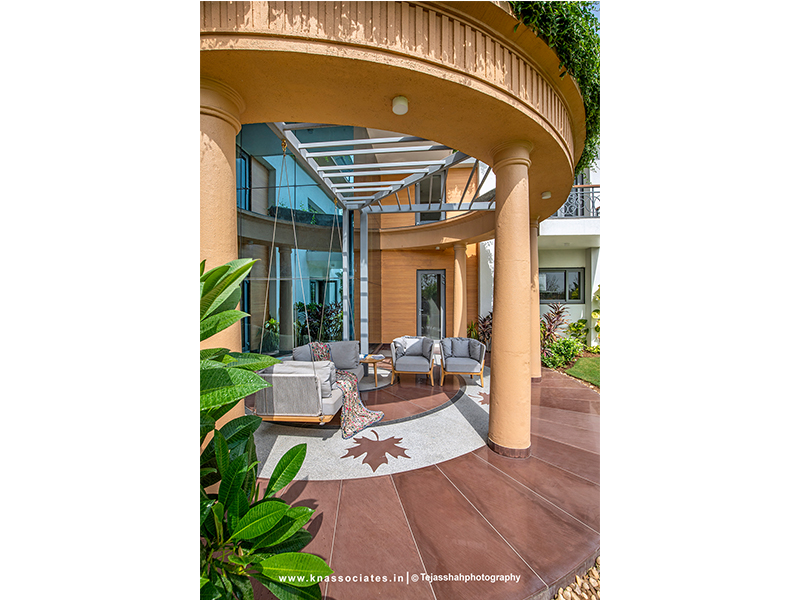
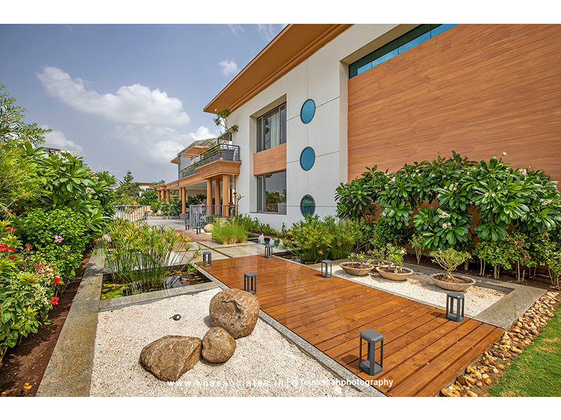
The house comes across as a geometrical riot where different forms of squares, rectangles and circles are visibly juxtaposed. Thereby, adding a lot of vibrancy, interesting massing and life to the building.
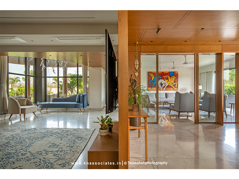
The duality as well as smooth transitioning within the house is what makes it stand out.
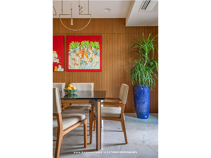
‘Less is more’ and that surely is very well etched in the subtext of Pushpatma.
Photography by Tejas Shah
